Yesterday, I spent most of my morning exploring youth culture in Harajuku. Upon leaving the exit of Harajuku station, I was immediately greeted with the loud, bustling entrance of Takeshita Street and it didn’t take long to notice how stores had multiple methods to attract their target audience of teenage girls in this 400-meter-long street.
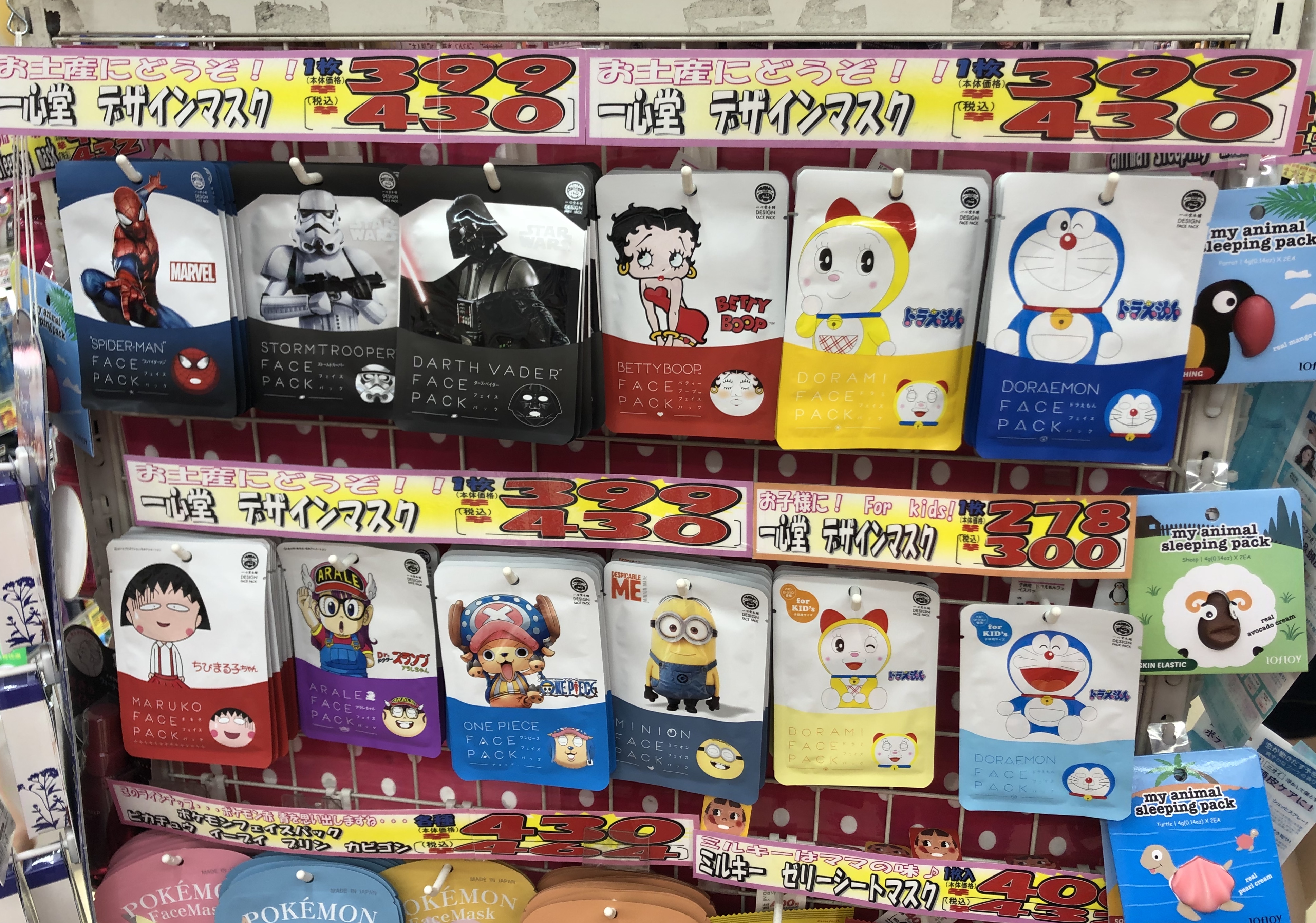
For this drug store, the shop owners first used a comic-like font, which implies that the store is informal and designed for children and teenagers. Apart from the comic-like font, the store also utilized bright, poppy colors both in their choice of products as well as in their price tags, both of which serve to attract the eyes of teenage girls walking down Takeshita street, as discussed in class. It is important to note the choice to place character face masks at the very front, as it is likely that these characters are prevalent among Japanese youth culture and are being sold as a form of fanshii guzzu, which if you don’t remember from my first blog post, “are goods that are small, cute, decorative personal items often marketed to young women” (Occhi).
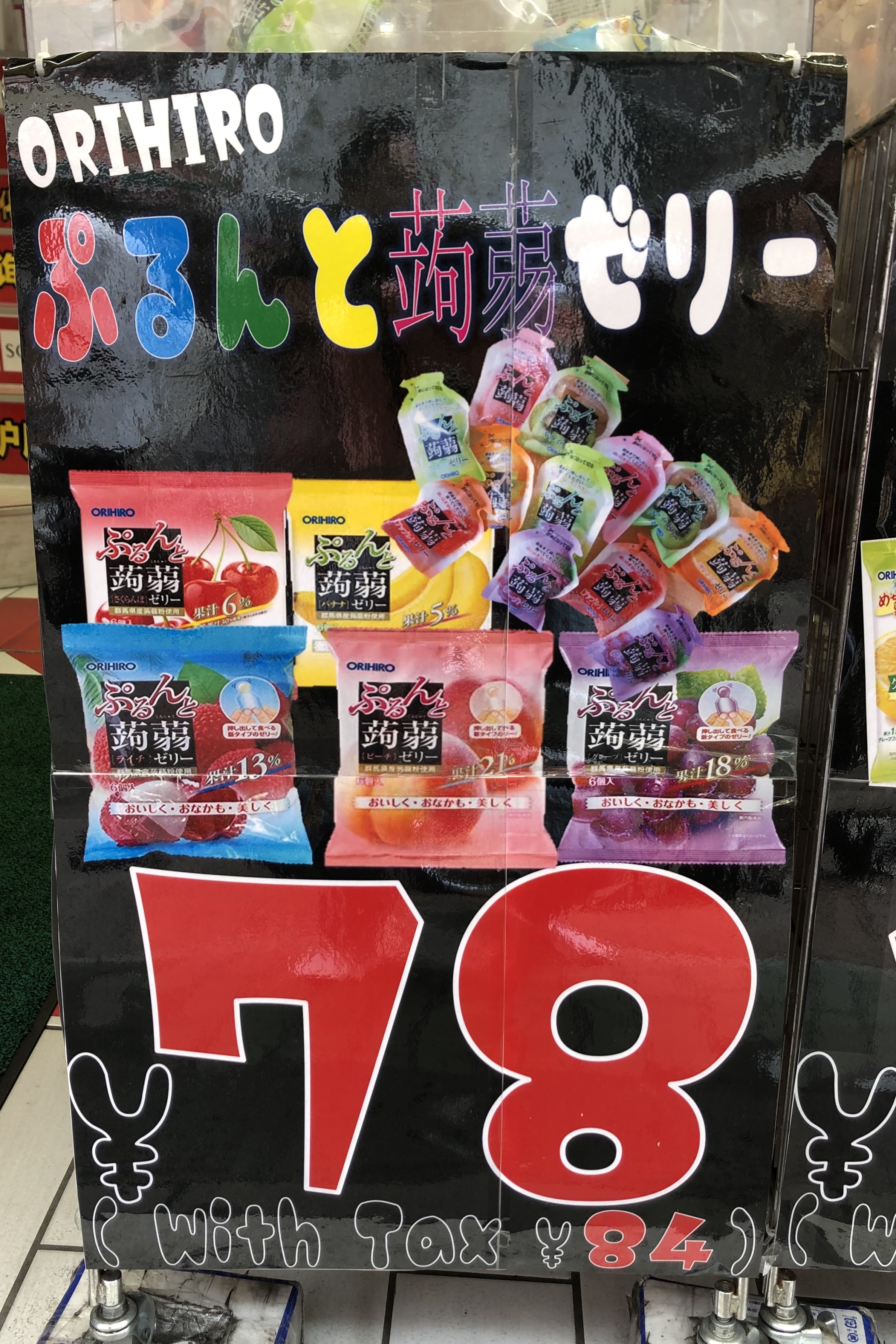
Like the drug store, the snack store uses a comic-like font for their characters and bright colours, which is further emphasized here with the black background, to appeal to the eyes of people walking down the street. Additionally, it was also discussed in class how the prices of goods in Harajuku was much lower in comparison to other places like Shibuya, Shinjuku and Akihabara. This is likely because stores understand their target audience consists of teenage girls and as such will not have much money to spend when they shop.
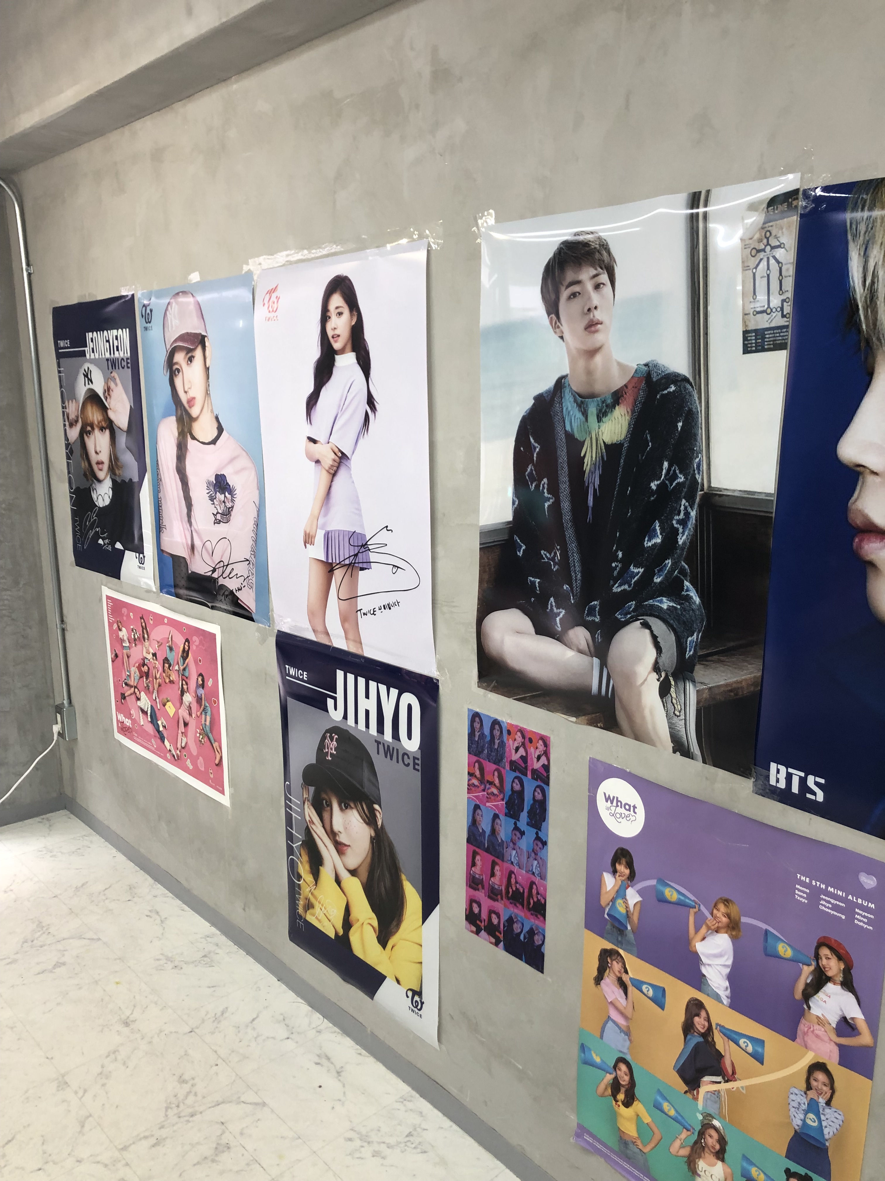
The posters on show in the store 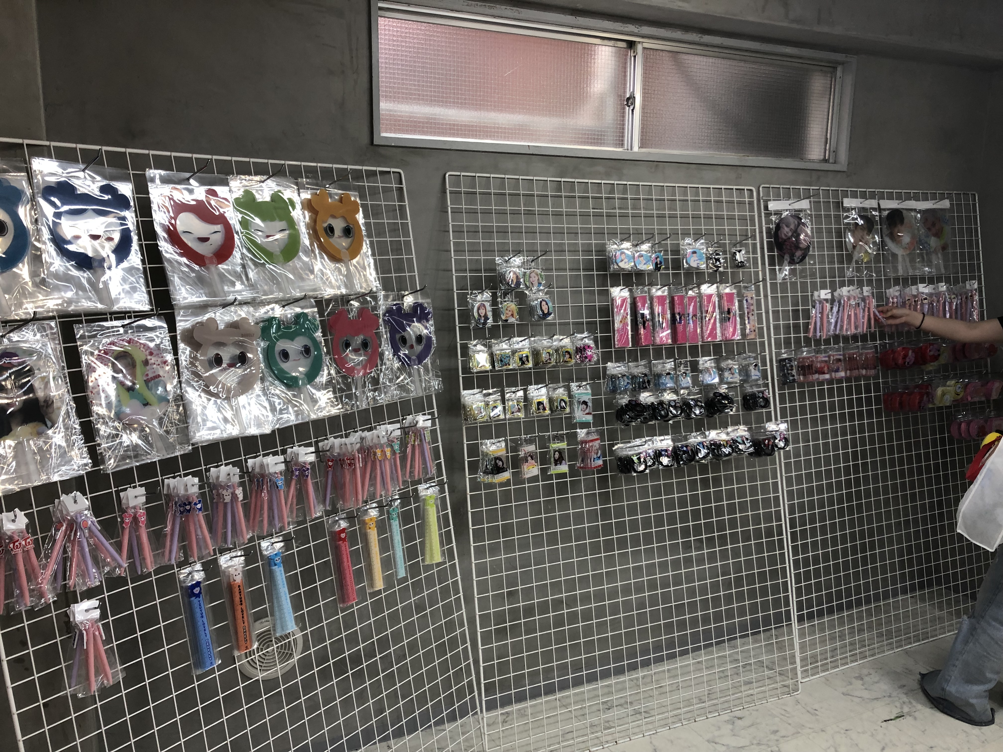
The various merchandise available for sale 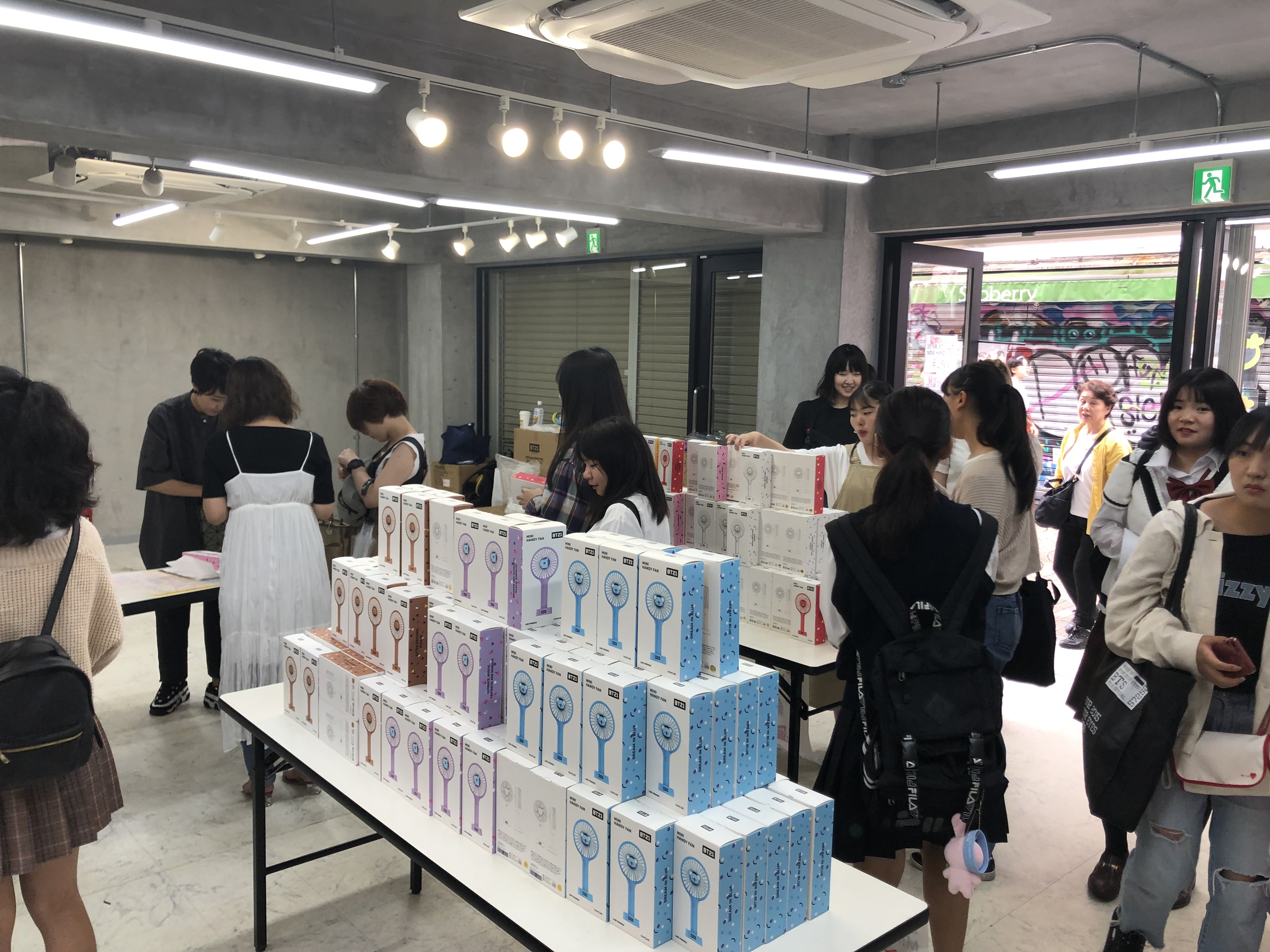
The customers of the idol store
On first glance, this store may seem like a counter example to the first two pictures I had as this store is the opposite of colourful with its bland, grey walls. However, with the help of K-pop blasting through speakers on the outside, this idol store does not need anything else to draw both teenage girls and young adults (including me) into the store. While its appearance may look vastly different in comparison to other stores around the area, the inside is similar, with idol posters and idol related merchandise on sale. The merchandise here as seen on the rack includes fans, pens, rulers, hair ties and bag decorations, all of which are goods marketed towards teenage girls. With most items costing less than 1000 yen, the store further encourages teenage girls to come shop as they wouldn’t break the bank by doing so, as seen in the third photo, in which every customer is female.
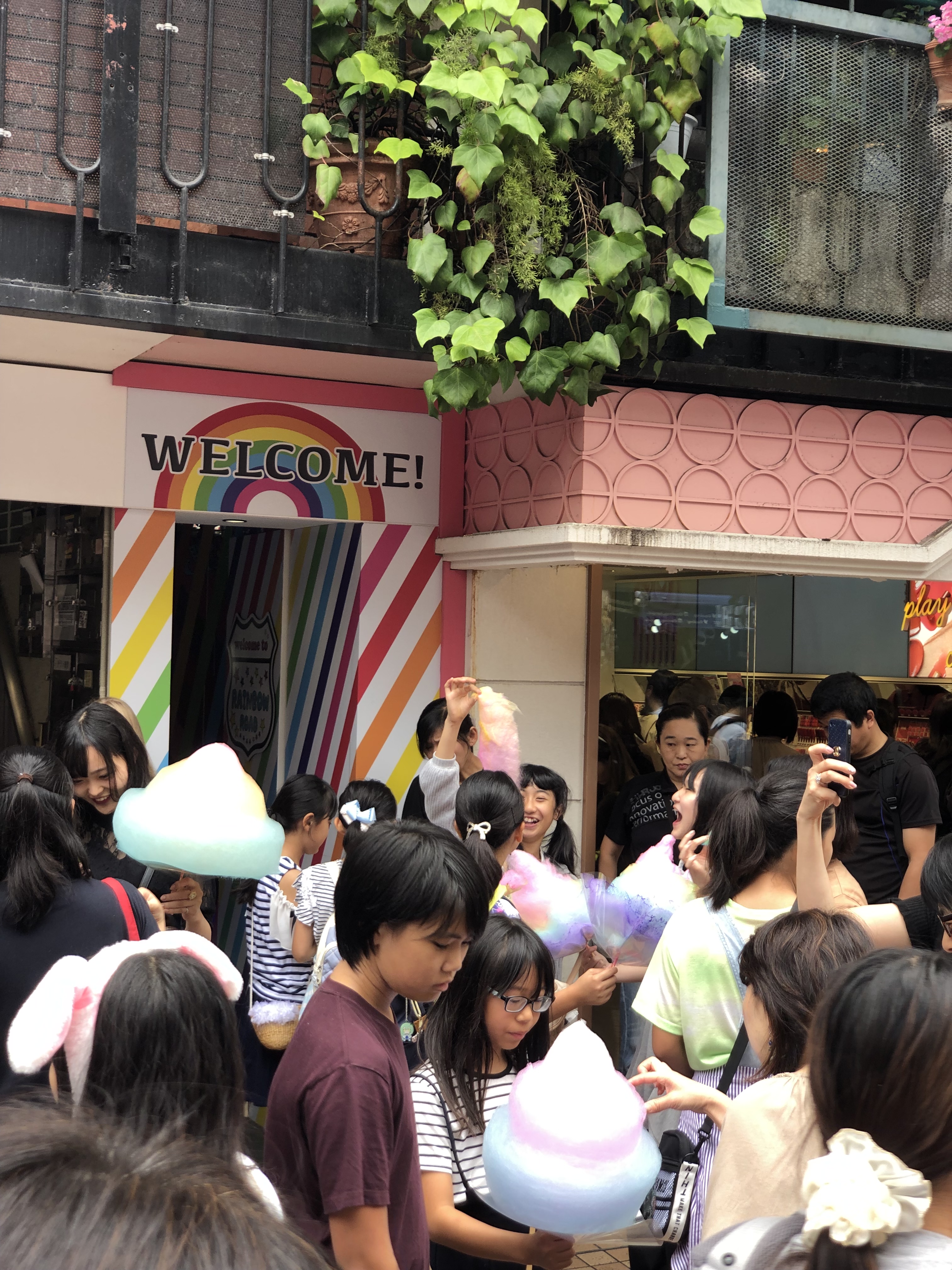
Teenage girls enjoying their cotton candy 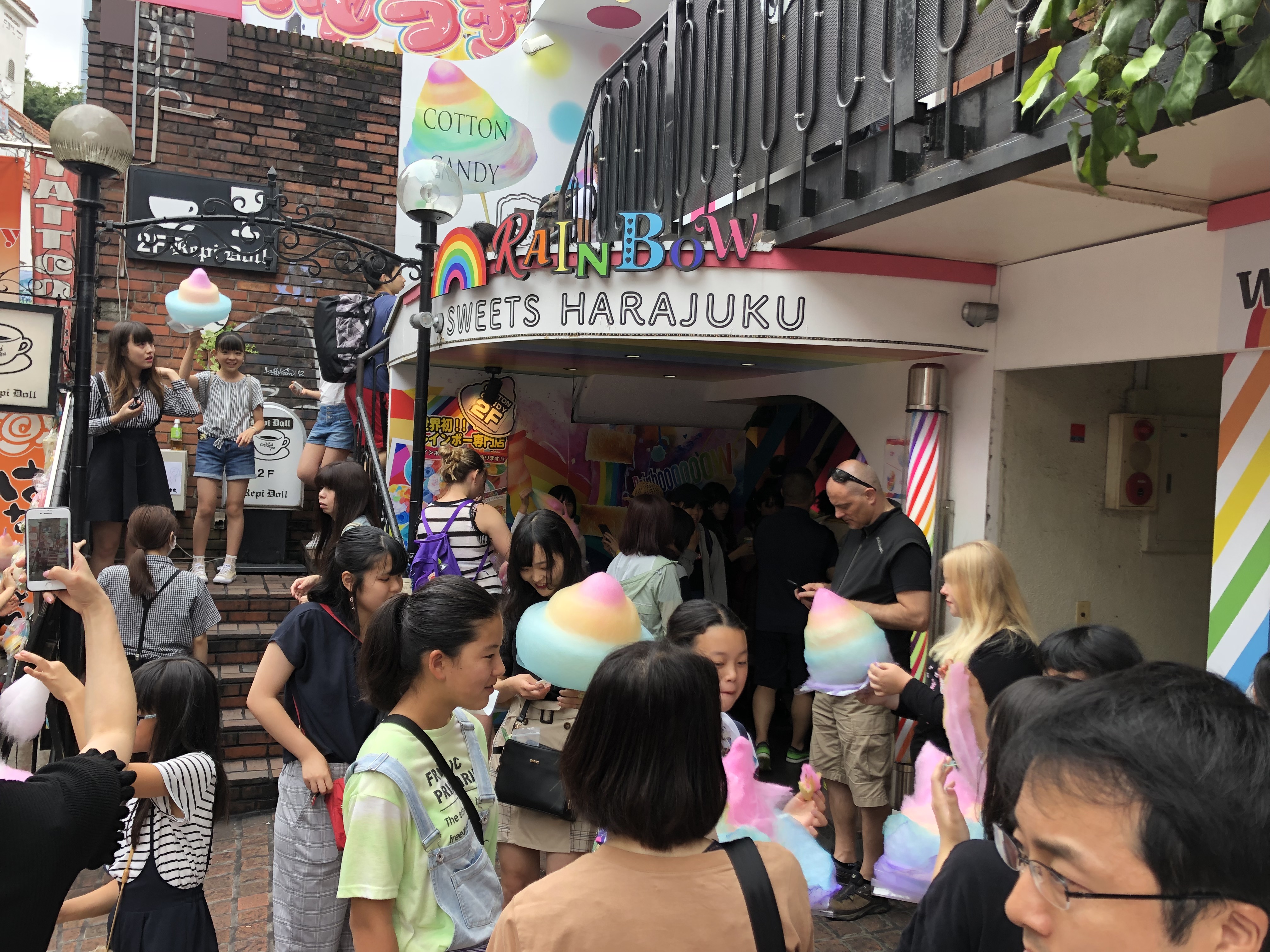
The images above depict a sweets store that specializes in rainbow coloured cotton candy. Following the theme of using bright colours, the storefront and product itself is very colorful, attracting countless teenage girls and some young adults, as seen above. It is also similar to the idol store as it is mainly young females that are shopping. In these pictures, not only are they eating the cotton candy, but they are also taking photos and likely sharing said photos on their social media, another important aspect of youth culture in Japan, which was briefly discussed in class as well.
Having visited Takeshita street before, it was interesting to see how many seemingly obvious things I missed after putting on my critical lenses on for this trip, making this visit feel like an entirely new experience despite little changes to the street itself.
Occhi, Debra J. “Kumamon: Japan’s Surprisingly Cheeky Mascot.” Introducing Japanese Popular Culture, edited by Alisa Freedman and Toby Slade, Routledge, Taylor & Francis Group, 2018, pp. 13-23

I actually think the idol shop continues the trend of using eye-catching colors – they just do it a little differently. The grey walls help make the merchandise stand out from everything else to catch shopper’s eyes.
LikeLike
that’s an interesting point. I am scrolling up now to relook at those pictures. Holy crap. You are right! This aesthetic is often called modern minimalist. The idea is that the grey is a completely neutral color, which highlights all other colors. I wonder how much Muji has had an effect on this since this was different when I lived here. Idol shops were not quite this polished.
LikeLike
Yeah I never really considered that and now that you mention it it sounds obvious to me. Thinking back to it, I feel like it did catch my eye just cause of how much the posters stood out in the store.
LikeLike
I agree with your thoughts on shops in this street use pastel colors to attract teenage girls or even young adults. Have you thought about there is even more specific age group that stores on this street are trying to target? For example, I think maybe the face mask are market towards female who in high school or above verse the cotton candy is more for Middle school girls.
LikeLike
Is that true based on who we saw eating the cotton candy. It seemed like novelty food. Something that you would get one time to say that you did the thing (like fire ramen in Kyoto), but never again since the novelty has worn out. I wonder if those giant novelty things can exist because the tourist market is so big, so Japanese people can enjoy novelty, but the market can include anyone as a tourist. The overview of the intro to pop culture book talks about novelty economies, which are central in understanding how popular culture can work.
I do like the close visual rhetoric reading on how girl-hood is signified 🙂
LikeLike
I do agree that the K-pop store seem a little more neutral, but do you think it could be from the fact that the stores were actually trying to attract parents, because I assume their prices might be a lot more expensive than the other brightly lit stores out front. They could have brought the kids in through the brightly colors, but then made it so parents were a lot more comfortable in the store itself so that they would wait around for their kids to find what they had wanted so that they could pay for it.
LikeLike
I am not sure I saw parents going into K-Pop stores. Did I possibly miss this? I think part of the idol stories is that the margin of profit and failure is so tenuous that there is not a lot of money for decorations. I remember that these seemed more slummy when I was younger. This pic seems way more cleaned up; however, the pricepoint seems to still not be high-profit.
Thinking about the readings that we did on Shibuya and Akihabara, I wonder how the process of becoming “mainstream” is affecting the cost of business, which businesses are courted and supported in the sakuraba, and the general feel of the street. If, indeed, harajuku was a type of counter culture, but now it is a stop on the tourism bucket list, what’s that doing to the culture of the street and neighborhood. I seemed to remember that Shibuya-like gentrification’s line was way closer this time.
LikeLike